In outdoor advertising, “having visibility” does not always mean “building a brand”.
You can be in a prime location, with a large format and high frequency… and still be forgotten by the public as just another impression. Why does this happen? Because seeing is not the same as recognizing.
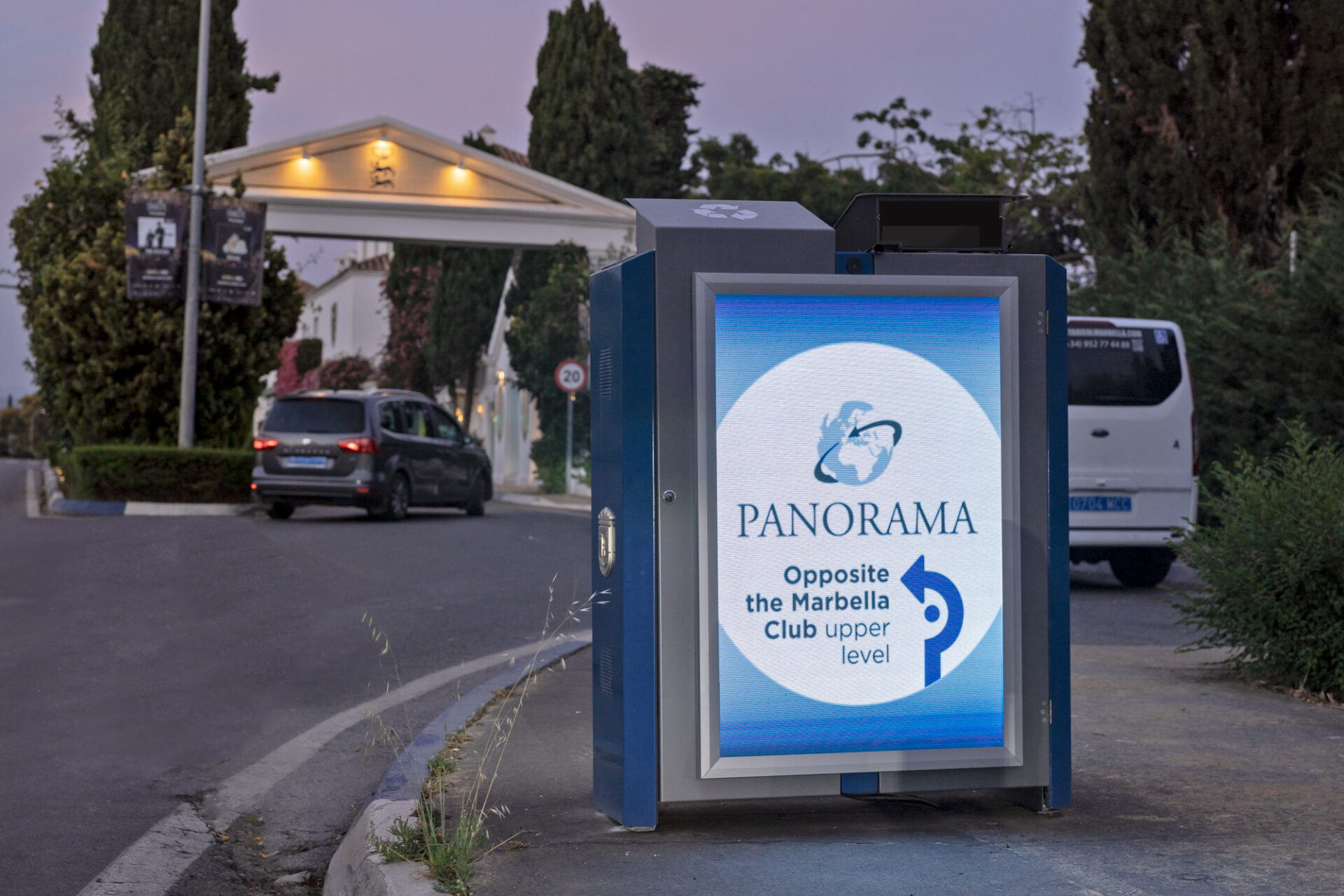
In OOH (Out-of-Home) advertising, attention spans are brief and the context is fast-paced: people look while driving, walking, or waiting. In this scenario, a brand thrives when the audience identifies who is speaking without having to think too much. And that’s achieved with one key word: consistency.
Here are three practical tips to ensure your campaign is not only seen but also recognized.
1) Consistent Visual System: It’s not about aesthetics, it’s about memory.
Recognition arises when you repeat a unique “visual language.” It’s not about everything being identical, but about having a recognizable foundation: colors, fonts, style, and composition.
When you constantly change these elements, you force the viewer to start from scratch with each impression. When you maintain them, the brain does the opposite: it associates and remembers.
Quick Visual System Checklist:
- 1–2 dominant colors (and one accent color, if needed)
- Consistent fonts (maximum 2)
- Defined image style (lighting, framing, tone)
- A repeatable structure (where the headline, logo, and main visual go)
This isn’t about “pretty design.” It’s a tool to make your brand stand out.


2) A well-repeated message: intelligent repetition multiplies the return on investment.
Out-of-home advertising is an advantage. Changing the concept every week might sound dynamic, but it often reduces the cumulative effect: each new creative element restarts the learning curve.
The key is to repeat the essentials (idea, promise, tone) and vary only what’s necessary (product, location, season). This way, each impression builds upon the previous one instead of competing with it.
Best practice:
Maintain a concept long enough for the audience to “register” it. If everything changes all the time, your campaign might generate impressions… but it won’t leave a lasting impression.
3) Clear hierarchy: Understand it in seconds
Out-of-home advertising isn’t meant to be read. It’s meant to capture attention. That’s why hierarchy is critical: the viewer must understand what it is and who it’s from, very quickly.
Prioritize:
- A main idea (short headline or key phrase)
- A dominant element (image or graphic block)
- A visible brand (without clashing with the rest)
- Secondary information only if it contributes and is easily understood
Fewer elements, better readability. Better readability, greater recognition.
The quick recognition test
Try this test with any creative: cover the logo and ask yourself:
Would it still look like my brand?
If the answer is “no,” you’re probably creating isolated ads instead of a cohesive system. And in OOH, a cohesive system is what transforms a campaign into a brand.
Conclusion
In outdoor advertising, consistency isn’t a creative detail: it’s strategy.
When your campaign is recognizable, each impression is worth more. And that’s what turns visibility into brand positioning.